Tuesday, 28 June 2016

Summer Of Creative Chemistry - Week 4

It's time to share my week 4 project for Summer of Creative Chemistry!
This week's challenge is to create a project using Archival Ink.

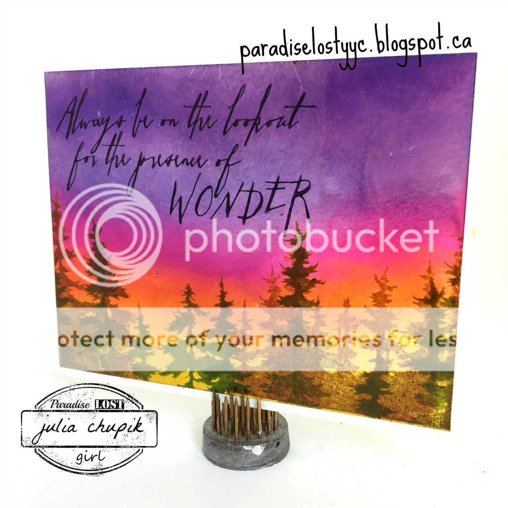
My first project is a card using the Archival Ink Resist Technique.
This is a really fun technique that I don't think I've used since the first time I took
Creative Creative 101. It was wonderful revisiting it!


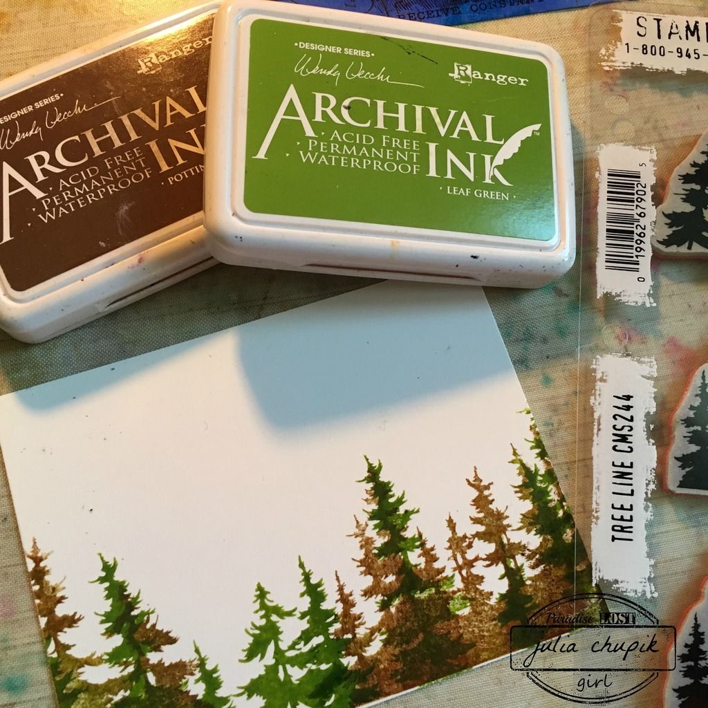
I started by stamping my trees on glossy paper using Potting Soil & Leaf Green Archival Inks.

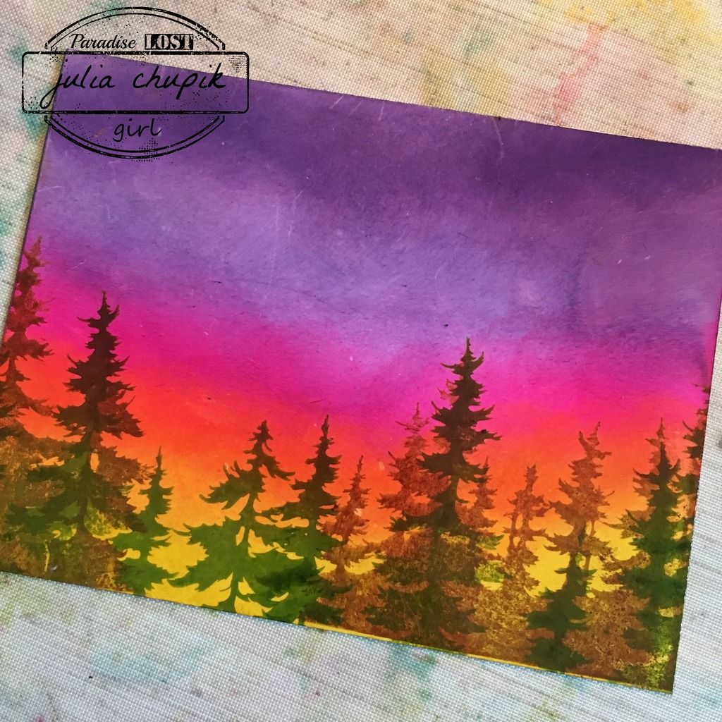
I then gathered a few different colours of Distress Ink and using my blending foam & tool tired to recreate the colours of a sunset.
I added my sentiment and adhered to my card base to finish it off.

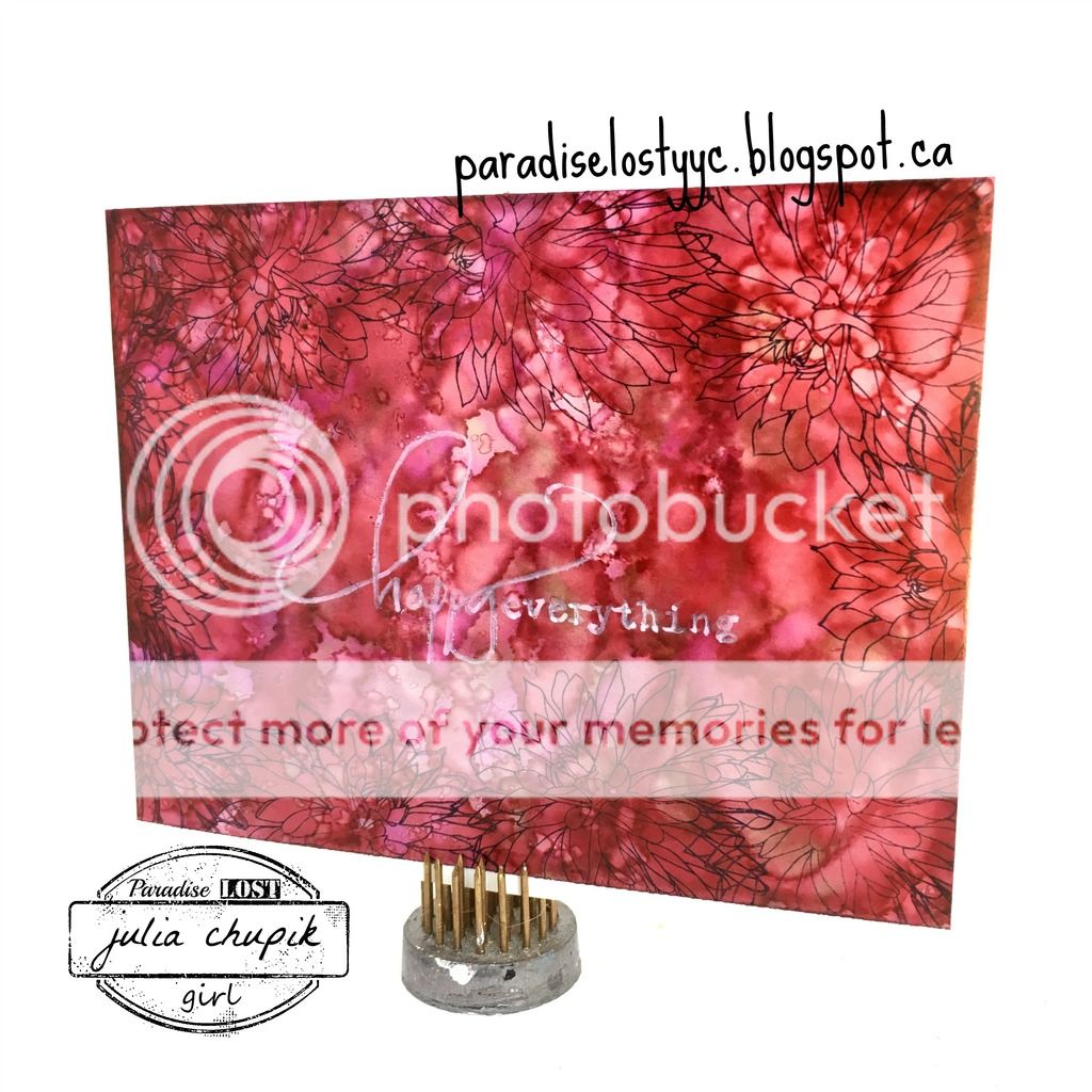
This card was so quick to make that I decided to make another card using the Alcohol Ink Agate technique on yupo paper with Archival Ink stamping.


Monday, 27 June 2016

Tim Tag Remix - June

Wow! I can't believe June is almost done!
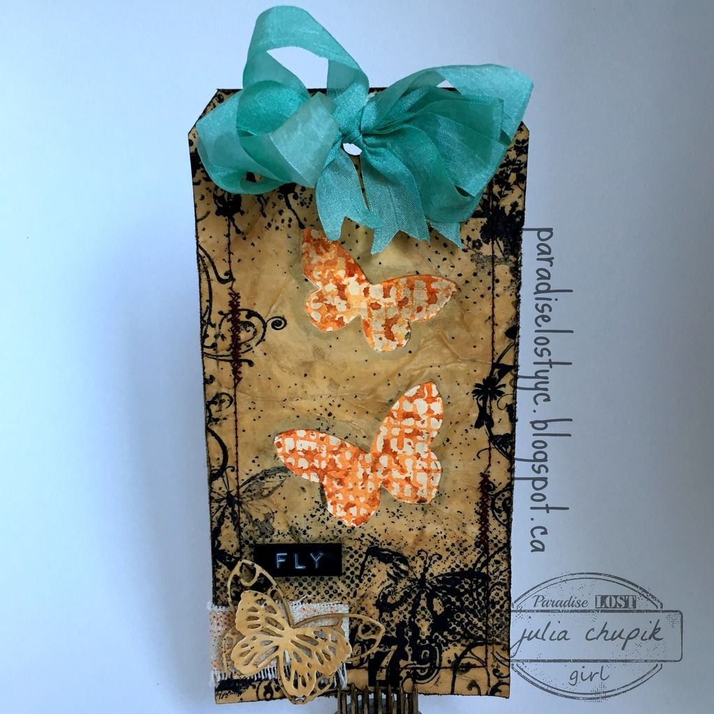
Thankfully, I remembered to get my tag done for Tim's Tag Remix.


This month Tim's tag was created using two techniques from 
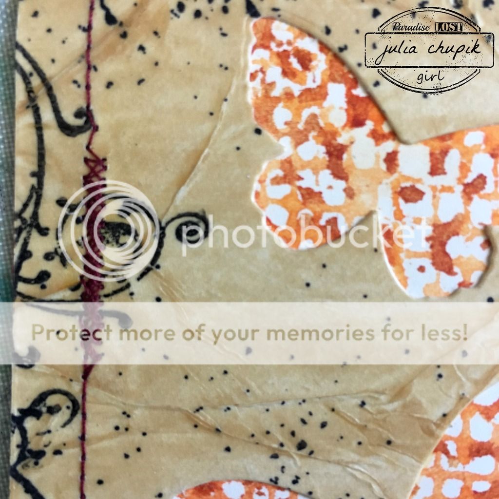
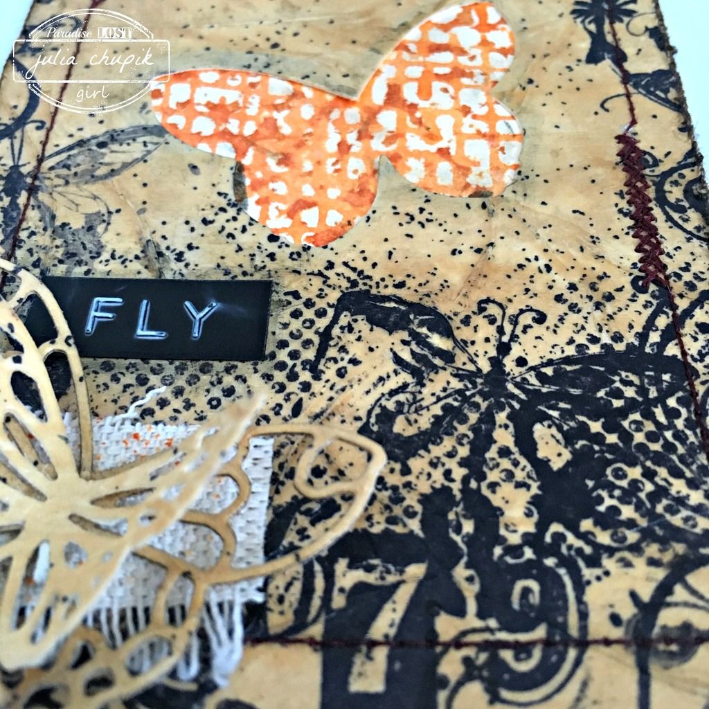
~My finished tag~

I didn't have the plain tissue wrap so I used some plain white tissue paper that I had on hand.
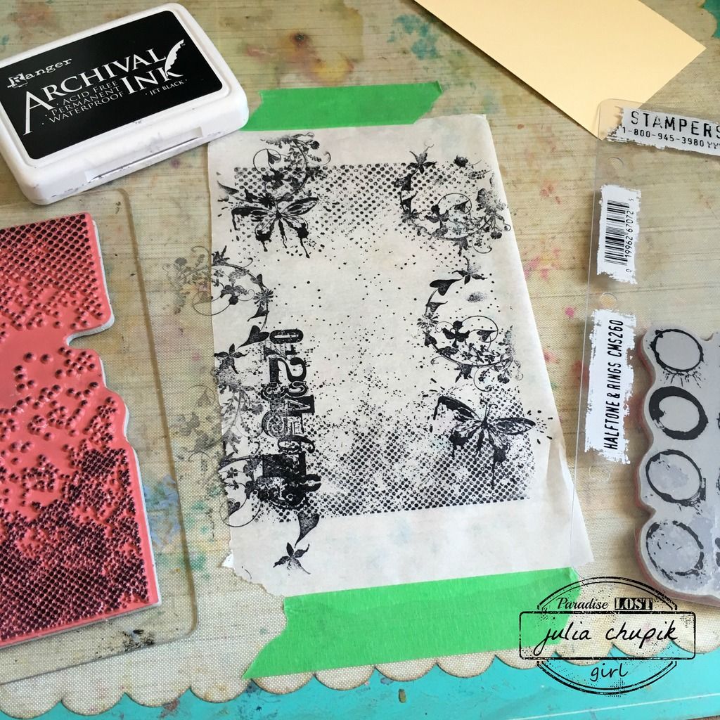
I chose a few stamps for my background and stamped them onto the tissue paper with
Black Archival Ink.

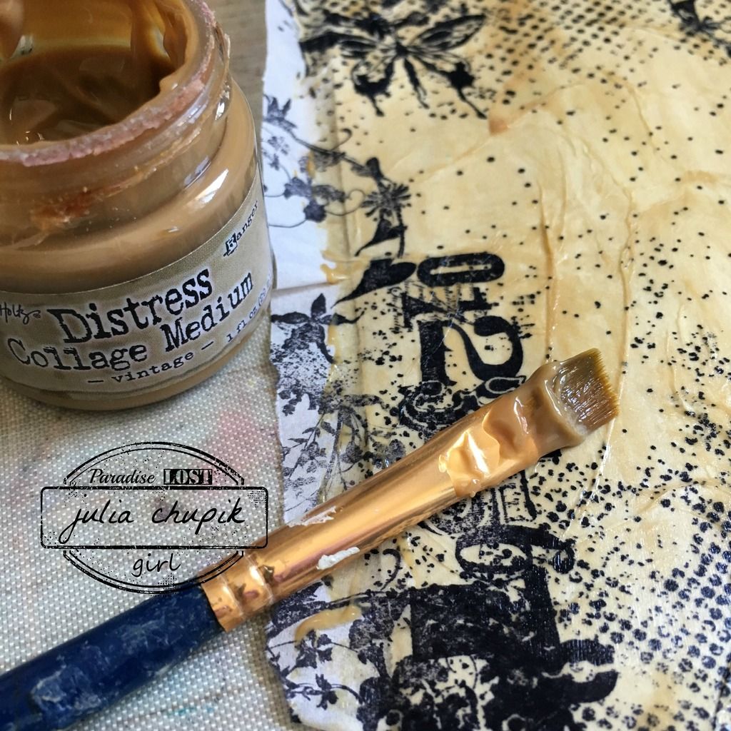
Once my tissue paper was ready I used Distress Collage Medium in Vintage tint to apply it to a piece of lightweight watercolour paper. I don't have the new substrate paper so I needed to make sure to use a paper that was thin enough to use with my thinlit die butterflies.

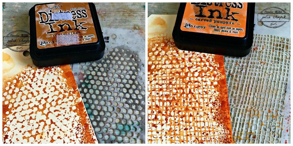
While this layer was drying I began working on my base. Tim uses the Stripe Layering stencil to create a plaid pattern. I decided to use two different layering stencils to create a different effect.

Once my tissue paper layer was dry I used 2 small, thin metals dies to cut out my butterfly images.
I adhered it over my base with Distress Collage Matte Medium then added a bit of stitching around the edge.

I layered my butterfly die cuts then adhered it over a piece of burlap to the lower corner of my tag and added a simple sentiment.


submitted to:


Saturday, 25 June 2016

Summer Of Creative Chemistry - Week 3

It's time to share my week 3 project for Summer of Creative Chemistry!
This week I rediscovered the awesomeness of  Perfect Pearls.
 Tim demonstrated 3 fabulous techniques but my favourite was
Perfect Splatter Distress Technique.

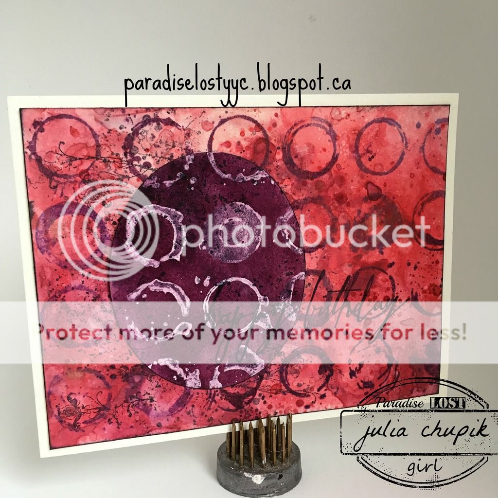
I decided to make a birthday card using the Perfect Splatter Distress Technique for my background and the Paint Dabber Resist Technique for my oval focal point.


Unfortunately, the shimmer from the Perfect Pearls does not photograph very well.

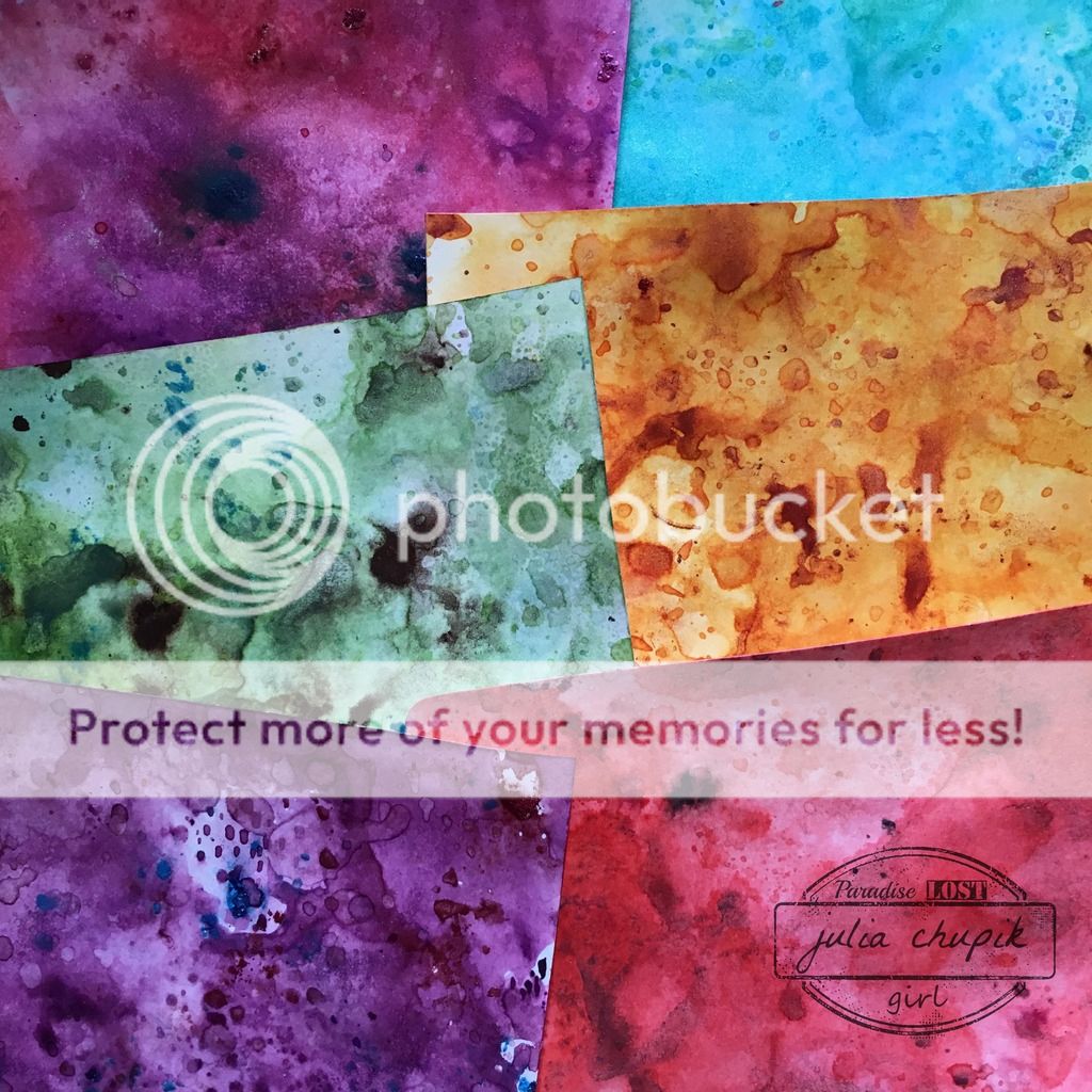
I was enjoying the Perfect Splatter Distress Technique so much that I made a few more card background to keep on hand.


Check out the Summer Of Creative Chemistry
and join in the fun!


Friday, 17 June 2016

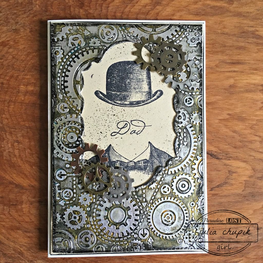
Father's Day Cards....for those special men in my life.

I am lucky to have 3 wonderful men in my life that
represent all the best qualities of being a great dad.

First up - my own dear dad. Living in a house with a
menopausal woman and 2 teenage girls must have been trying
but somehow he survived and still likes all of us. Now, he has 2 amazing son-in-laws so
all the drama we gave him was worth it.
Gears Embossing folder, Foil Paper, alcohol inks, bronze & black paint 

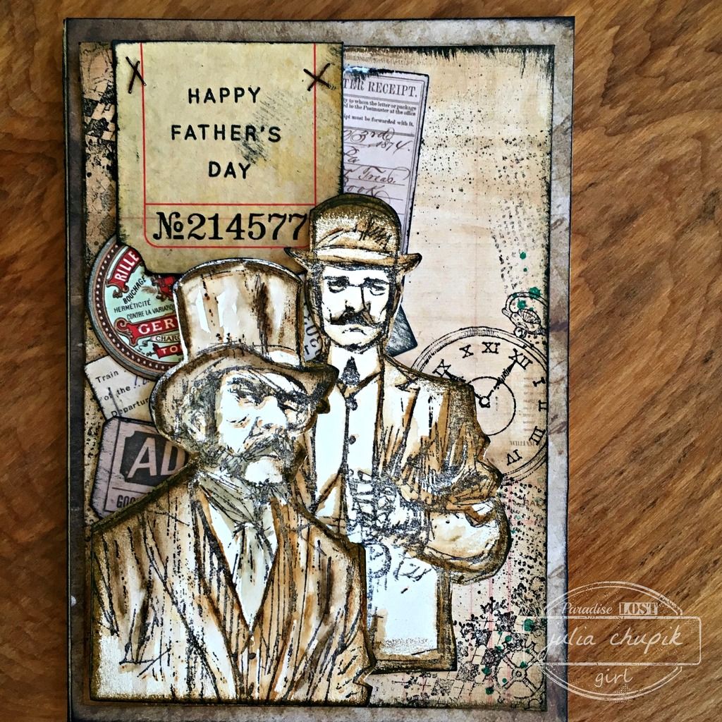
Next up my wonderful father-in-law. He set an amazing example of father & husband 
for his 5 sons. 
Distress Marker Water colour, stamping, ephemera

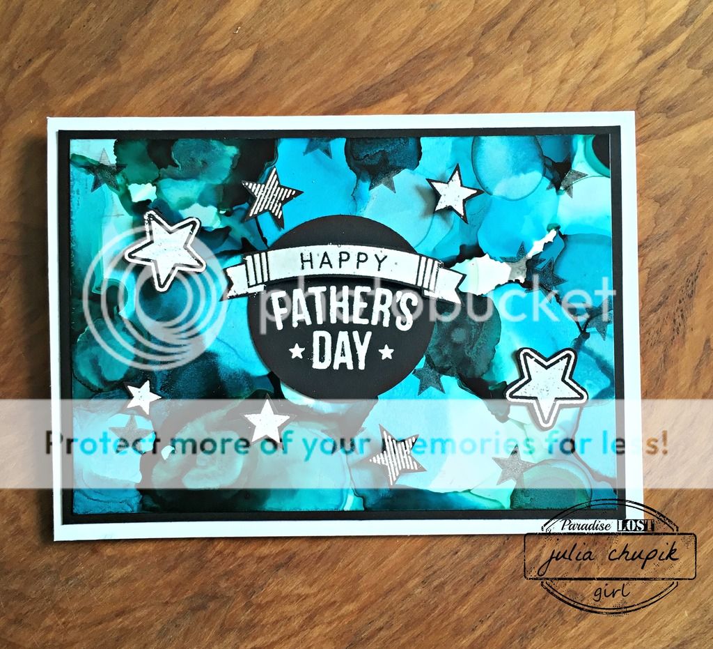
And last but certainly not least my husband and the father of our 2 kids.
For 25 years you have put up with my craziness and for 22 of those 25 years have been
a wonderful father to our 2 kids. Thank you for helping me to not screw them up.
Alcohol Inks on Yupo


Friday, 10 June 2016

Summer Of Creative Chemistry - Week 2

It's week 2 of the Summer of Creative Chemistry!
I was late starting week 1 because I thought I didn't need it. I did CC 101 & 102 already.
Why did I need to repeat it all over again? Well, let me tell you that revisiting these techniques has only opened my eyes to the new possibilities!
So if you are a Distress product fan and haven't decided on taking the course, it is well worth it!

Check out all the details here -

For week 2 we were challenge to use Distress Stains & stamping.

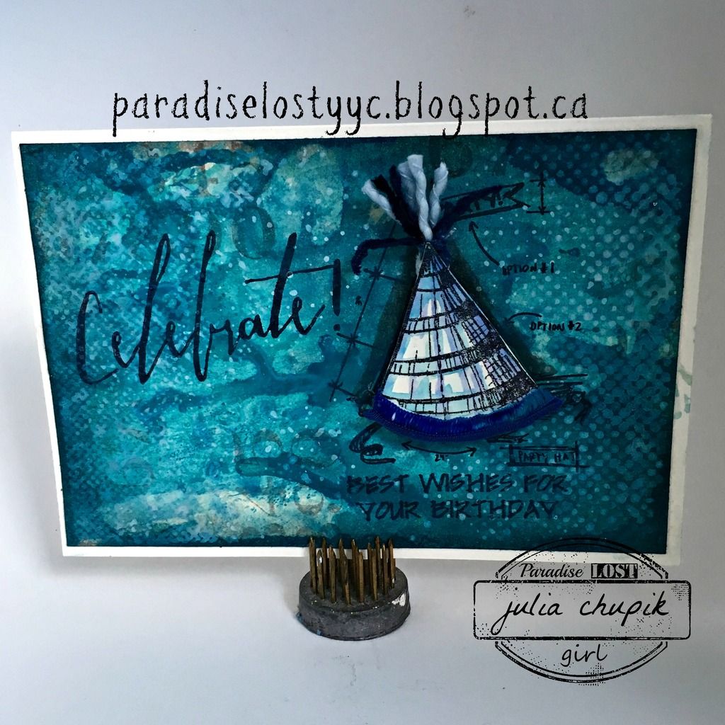
I decided to make a birthday card ~

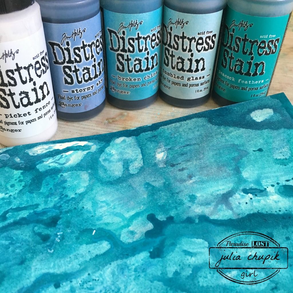
I used Stormy Sky, Broken China, Tumbled Glass, Peacock Feather & Picket Fence Distress Stains to create a marbled effect background on my card base.

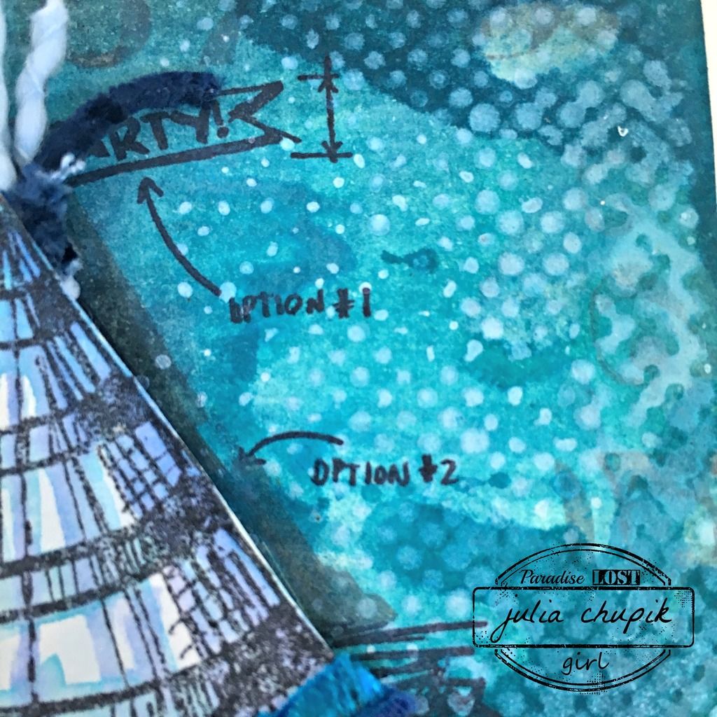
I then used the Halftone stamp (from the Halftone & Rings stamp set) & Picket Fence Distress Stain to stamp on top of the marbled background. 
Here is a closeup of the Picket Fence stamped over the background.
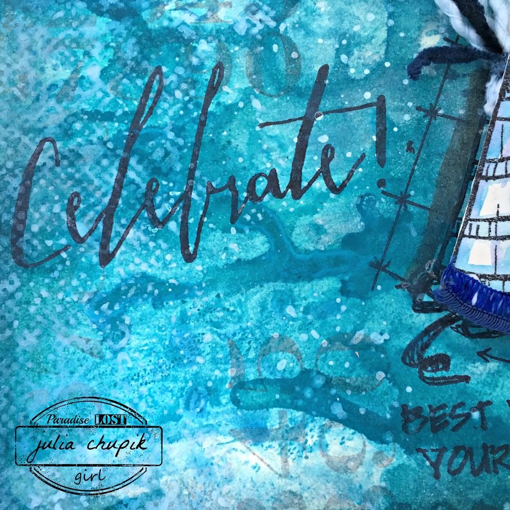
I stamped the the word "Celebrate" and the Party Hat image on the card.
I stamped the party hat a second time on to some watrcolour paper and used my Distress markers to watercolour the image before cutting the hat out and adhering it to my card. I added some ribbon to complete the hat.


Tuesday, 7 June 2016

Summer Of Creative Chemistry - Week 1

Did you hear the exciting news? Tim is introducing a brand new technique series - Creative Chemistry 103. CC103 will begin in August but in the mean time Tim will guide students through
CC101 & CC102 - with brand new challenges & giveaways.
Check out all the exciting details here and join in the fun!

For week one students were challenged to use four or more Distress Inks to create a tag, card or something else using a technique used in class.

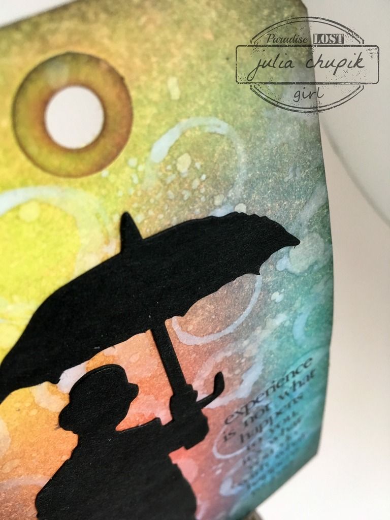
I decided to make a tag using 2 of the 3 techniques and 6 Distress Ink colours.

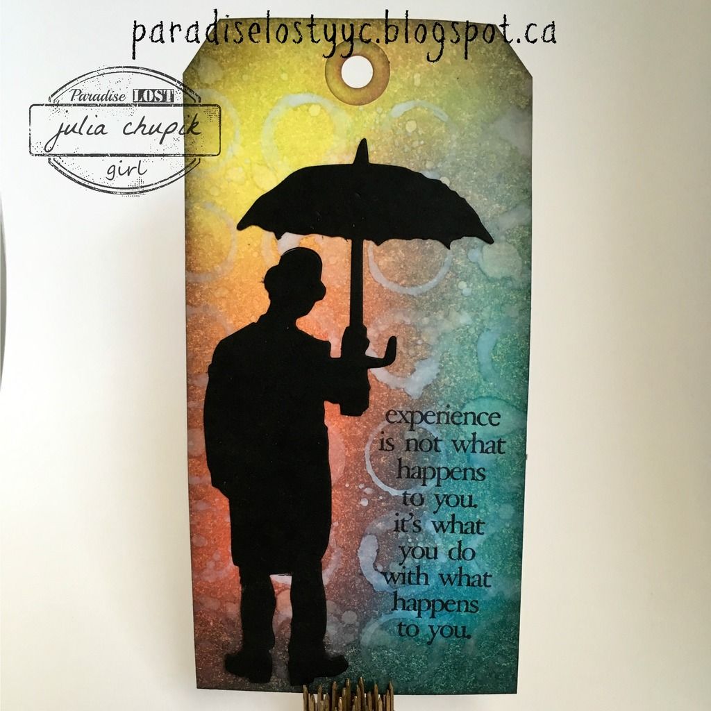
The Distress Inks I used for the Spritz & Flick are Twisted, Abandoned Coral, Salty Ocean and Tumbled Glass. Once I had flicked water over my tag and let it dry then I applied the brush-less watercolor technique. I applied Picket Fence Distress Ink to my Rings background stamp from the Halftone & Rings stamp set from Stampers Anonymous, spritz my stamp with my mister then stamped it on my tag.

I love how this technique turned out over my inked background.
I applied Hickory Smoke Distress Ink with my round blending tool to the edges to finish it off.
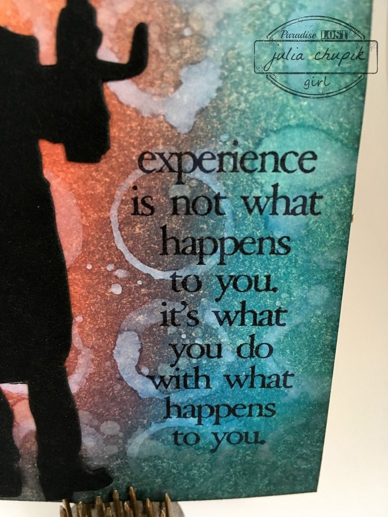
Finally adhering a die cut of Umbrella Man and a sentiment stamp from the Stuff To Say set from Stampers Anonymous to complete my week 1 homework.


Submitted to: 


Monday, 6 June 2016

All The D's ~ Dashing Daylen

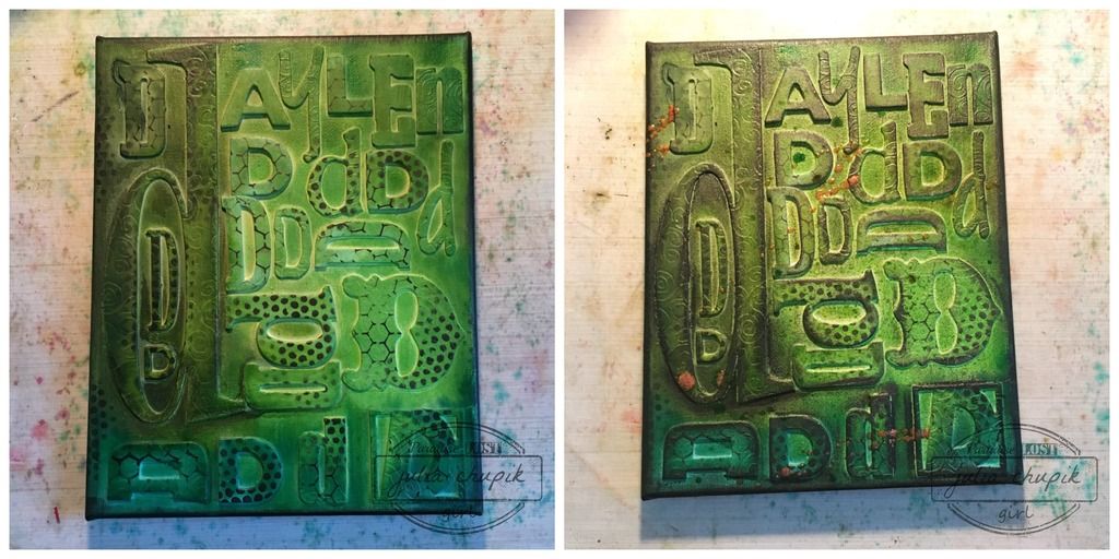
Hello! I am back today with another mixed media canvas I created 
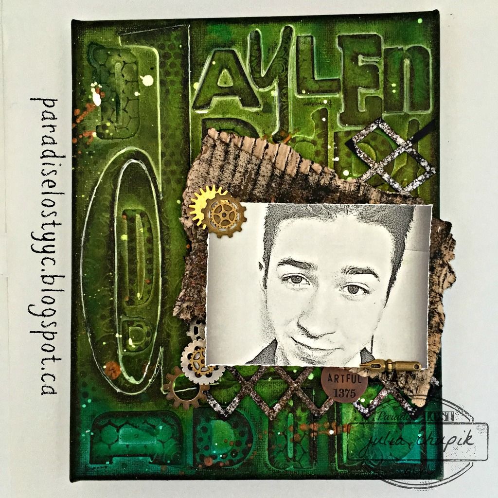
using chipboard letters from my stash. This canvas features a selfie photo I 'stole' from my son's Facebook page. He's my youngest and this past fall went off to college to pursue his dream of becoming a graphic artist/character designer. Check out his artist page on facebook to follow his journey and to see some of his art - Daylen Chupik ~ Artist.

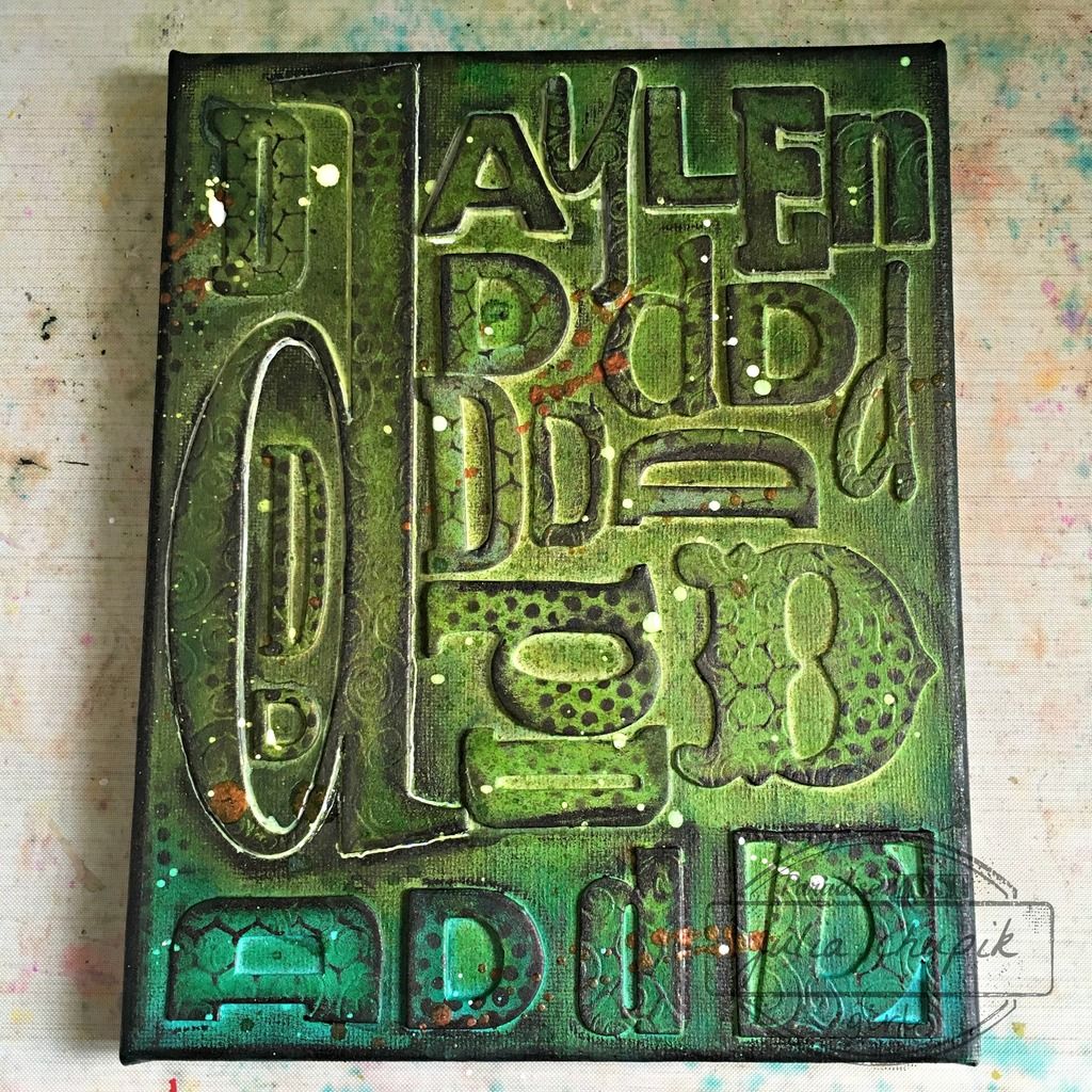
Here is my finished  canvas ~ 

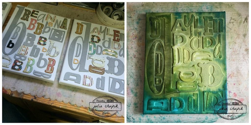
First I started with an 8x10 canvas and adhered my chipboard down with matte medium
then covering it the entire thing in 3 coats of gesso.
Once everything was dried, I started spraying my canvas with Dylusions Sprays ~
Fresh Lime, Dirty Martini, Polished Jade.

Once the sprays were dry I used my Black Marble Distress Paint & blending tool with a couple different layering stencils to add some random patterns & added some Peeled Paint & Cracked Pistachio Distress Ink. The copper splatters are irRESISTible Texture Spray from Imagine Crafts.

At this point, I realized that the letters of my son's name needed a little help to pop off the dark canvas background so I took a white fine point Sharpie Paint Pen and traced around them. I also used this pen to add some white splatters to help break up the darkness of the canvas.
To help 'frame' the canvas I added some more Black Marble Distress Paint with a blending tool
 to the sides and edges of the canvas.

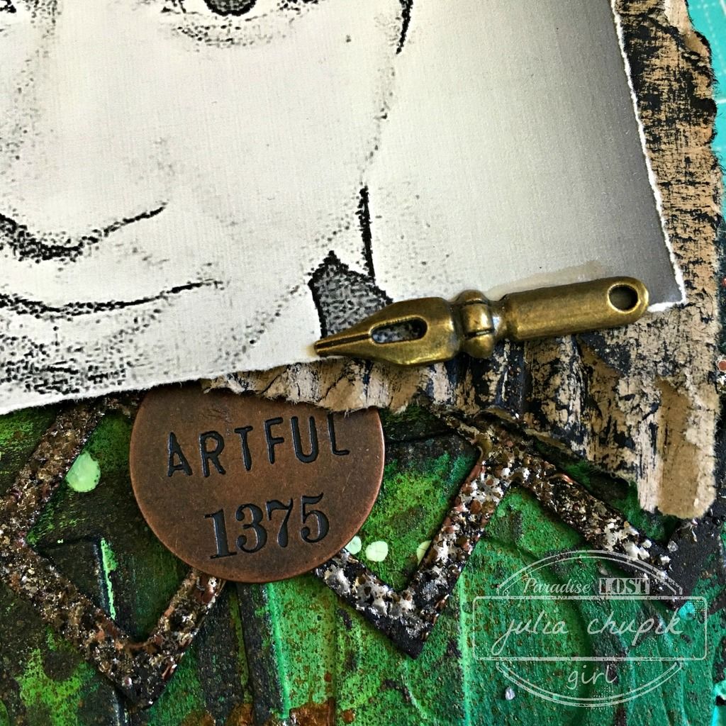
Now on to my focal point ~ the photo was a selfie I took off my son's Facebook page. I downloaded it and did some editing in PicMonkey before printing it off on linen cardstock.
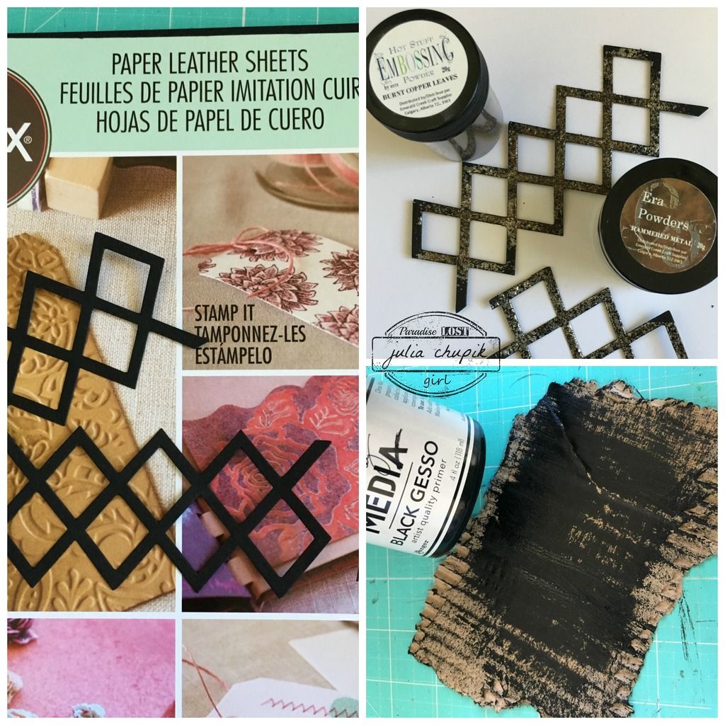
I used the Lattice Framework Die from Sizzix with the new Leather Paper Sheets also from Sizzix.
I added some Burnt Copper Leaves & Hammered Metal Embossing Powder from Emerald Creek Craft Supplies  to add a rusty metallic feel to the lattice.
 The anchor piece for my photo was some cardboard that I roughly torn up to be a little bit larger that my photo & dry brushed some black gesso over.

Here is a close-up photo of the lattice die with the embossing powders from Emerald Creek.
These powders are so delicious! I love every single one I have ever tried. Be sure to check out
the Emerald Creek store for these and so much more!

Once again ~ the final project. I enjoyed making these much and using up so many chipboard letters that I am also making more! One for me, my husband, our dog, a family one.....so many ideas!

Thursday, 2 June 2016

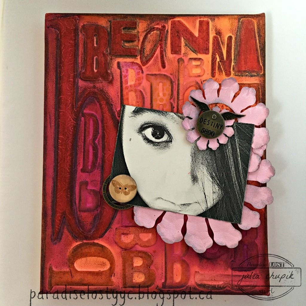
All The B's - Being Beautiful Breanna

Hello! I'm back this week with an idea that I have had going
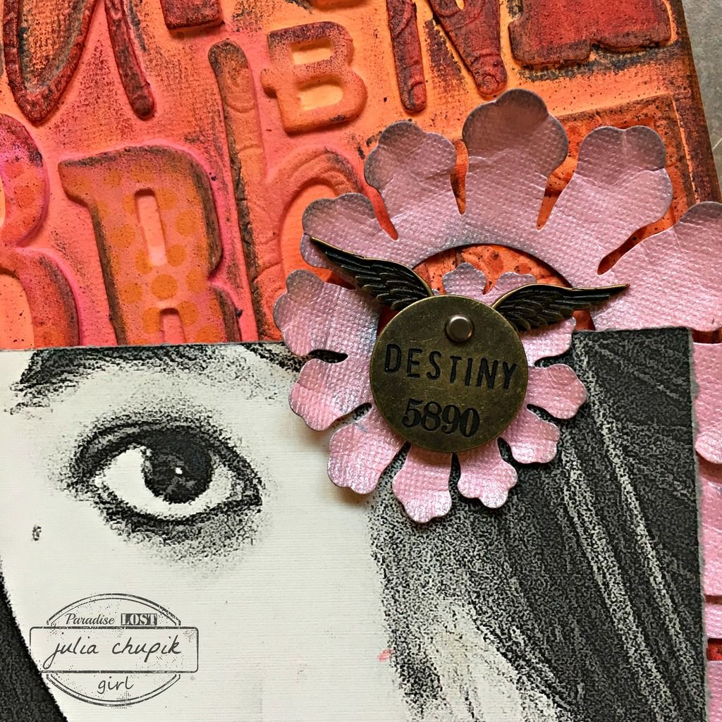
around in my head for some time. When I was cleaning/organizing/purging my
craft room a few months ago I realized that I had accumulated quite quite a lovely collection
of chipboard & grungeboard alphabets. It was time to start using these.

This is what I decided to do ~~~


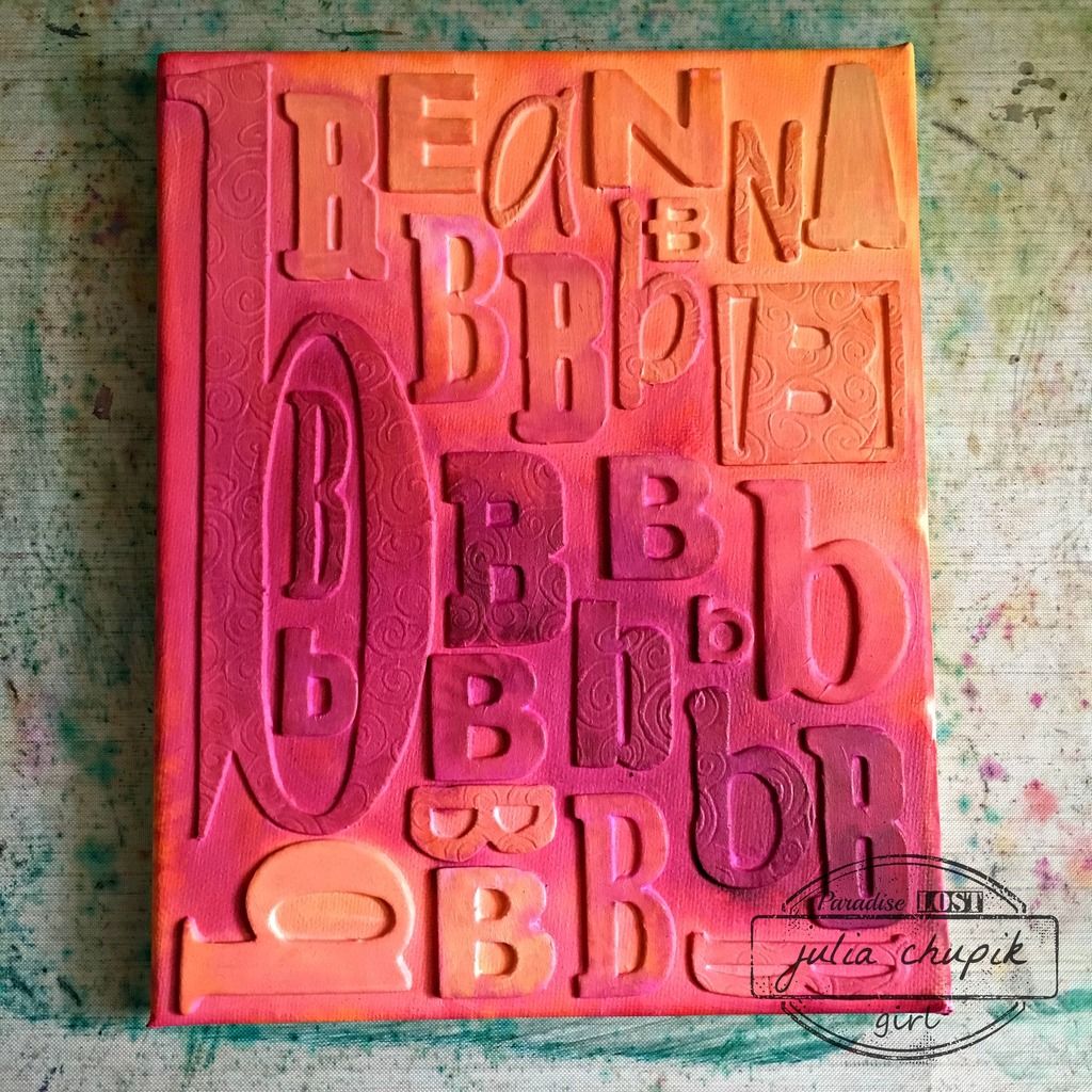
I started with an 8x10 canvas and my collection of alphabets.
I first went through and spelled out my daughters name then pulled out all the B's.
I figured out the layout then using matte medium adhered them all down to the canvas. I then covered the entire canvas in the matte medium. I let this dry completely then applied 3 coats of white gesso.


I was finally ready to add my colours -
Dylusion's Sprays in Pure Sunshine, Squeezed Orange & Funky Fushia.
I love these colours together! So bright & sunny.

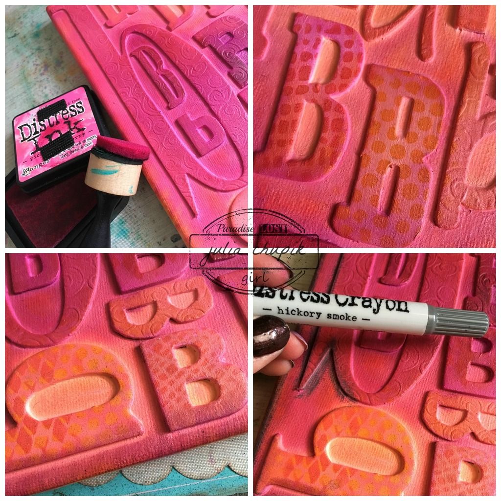
Next I added some Distress Ink in similiar colours just to help the letters pop a bit.
I also added some patterns using my layering stencils.
Lastly it was time to add a bit of grunge with my Hickory Smoke Distress Crayon along the edges and around the letters.

It was time for a few embellishments - 

I kept the embellishments pretty simple. 
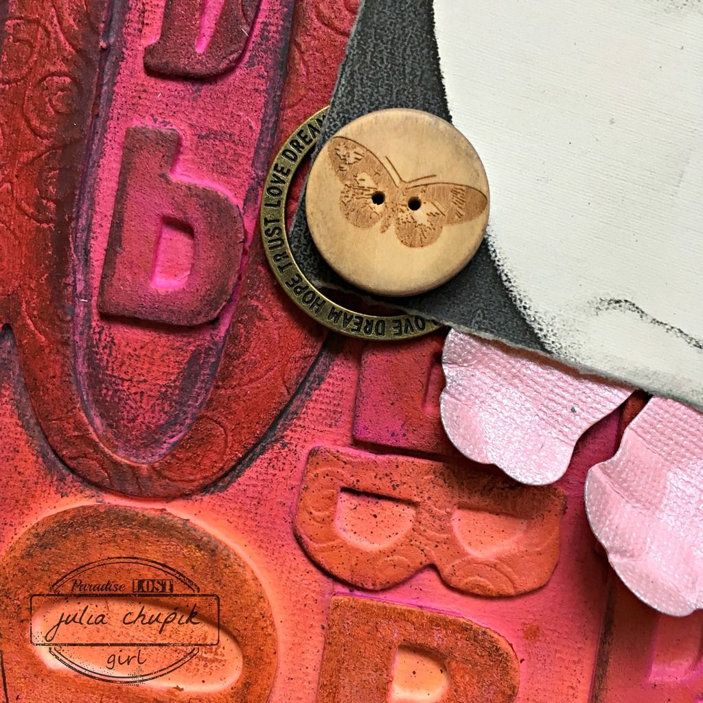
Thanks to my craft bestie Nicole Wright for letting me browse her impressive die collection - thats where I found the new Rolled Flower Die from Sizzix by Eileen Hull.
I cut the die cut in half stapled it back together in the shape you see here and using the blunt end of a paint brush shaped the petals. Before adhering to my frame I added a bit of Hickory Smoke 
Distress Ink to the edges.


submitted to the following challenges:

Rhedd's Creative Spirit - June Challenge